Quick loading pages
Continuing my how to sell your crap online tips, quick loading pages are an absolute must for an online store. You cannot pretend people will sit and wait for your web pages to load when they want to browse your inventory, get quick information or buy a product on a whim.
Check your image sizes, load only elements that are absolutely necessary, and for heaven’s sake, don’t add background music to your website, thinking you’re creating an atmosphere for your users. They’re just gonna shut if off anyway. If you’ve supplied them with a “stop” button, that is.
Solution: Make sure the nerd building your website knows his stuff, and doesn’t copy-paste code blindly or fills your website up with plugins to patch easily resolvable problems.
The overall user experience
I cannot stress enough how important this part is. We’re talking about the difference between visiting once and turning to another website, against becoming a returning visitor and converting into a returning client, or god forbid: a brand advocate.

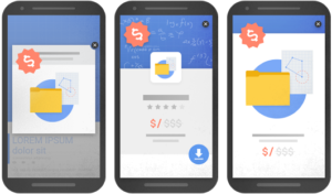
Popups requesting users to sign up, or like your Facebook page is exactly the type of thing that will get your browser window closed. So are too many ads or interstitial ads, which have become the bane of web advertisements, according to Google as well.
Solution: Make sure your website does exactly what it’s supposed to do, and that’s serve the visitor the info or products he was looking for, and not what you want to serve him. Propose subscribing to your newsletter or follow your social media channels during the acquisition phase or after it. Try to suggest it as a way to keep up to date with your offers and sales. Key phrase: give in order to receive.
Remember that the website is not made for you
I repeat this phrase so many times when I teach web design that people tend to come back at me with replies like “yeah, but my client is the one who’s paying” and poop like that.
The end user is the most important element of your website, and you should bend backwards in order to make him enjoy his experience on your website, if you want to sell your crap online.
A happy customer will not only come back for more when in need, but might actually tell his friends about it, generating free publicity for your super awesome online store.
Those are the most important elements
Too many online stores who sell crap online, or crappy stores who sell good products online will get some, if not all of these points wrong. So make sure you don’t, if you want to sell your crap online.
- Get your website mobile friendly approved by Google. Trust them, they know their stuff.
- Make sure your website loads quickly, or it will be closed quickly.
- Your website is supposed to serve your end user, not you. Get your UX ducks in a row and test, test, test.
Got any great online store tips to share with us in the comments section? go right ahead!
Get in contact with me if you want me to take a look at your website and let you know why it isn’t converting.

